Client
Officeworks
Discipline
Brand Campaign
Officeworks
Discipline
Brand Campaign
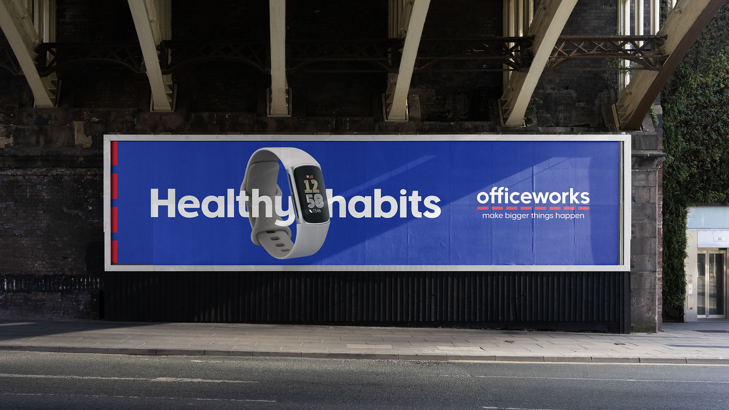
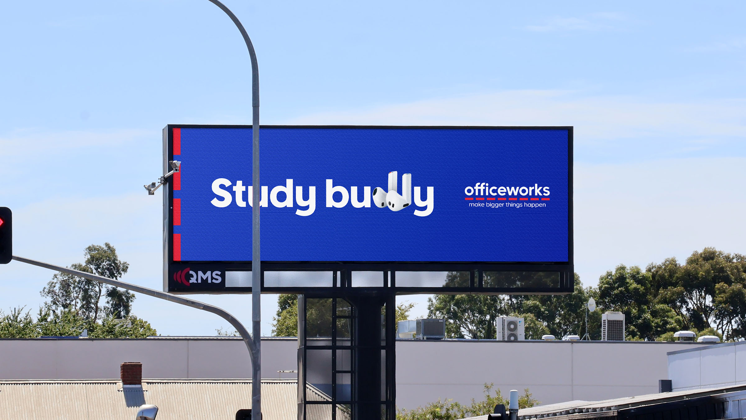
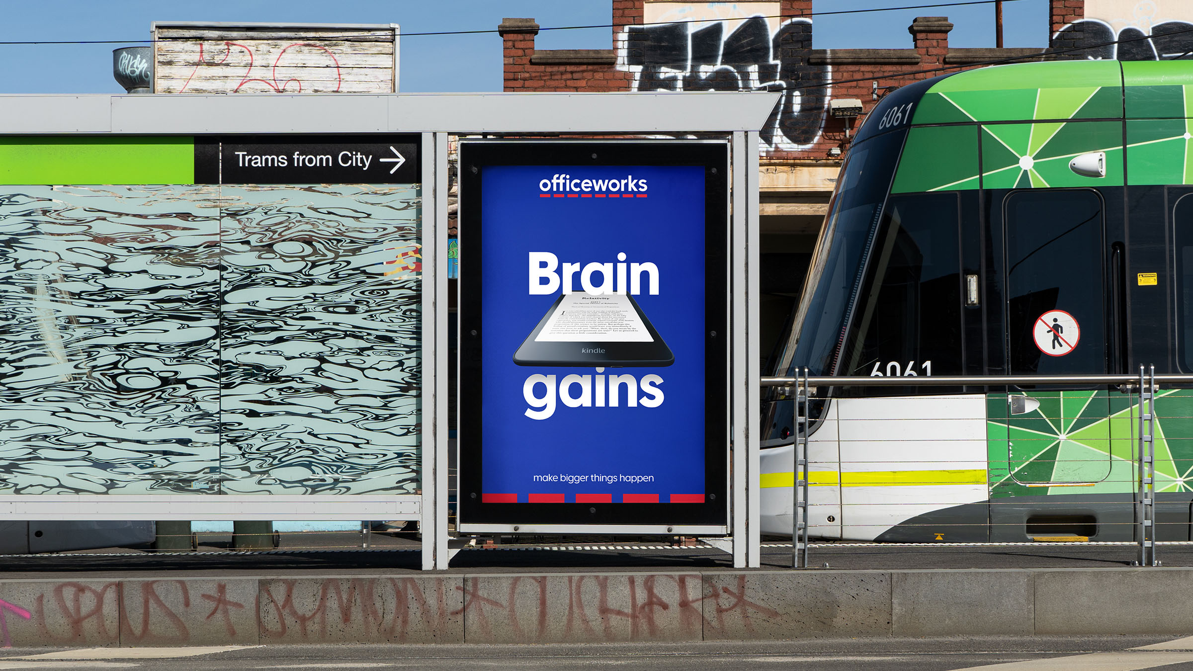
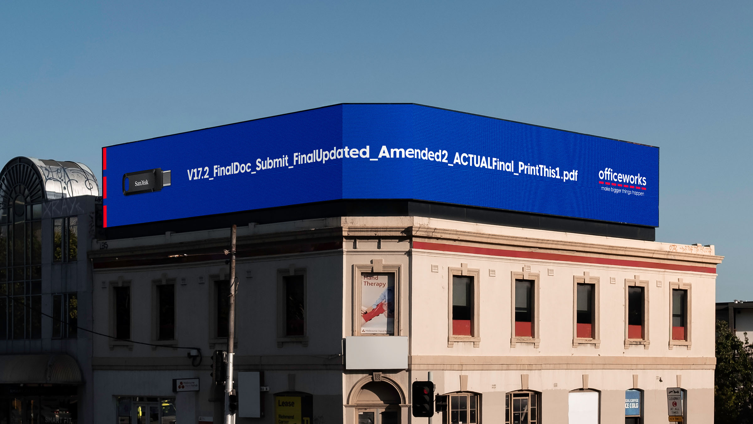
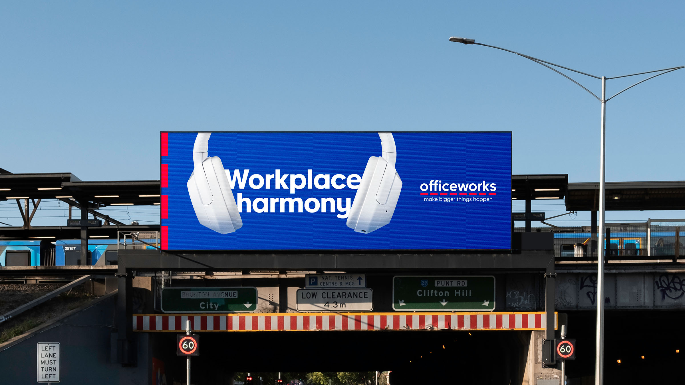
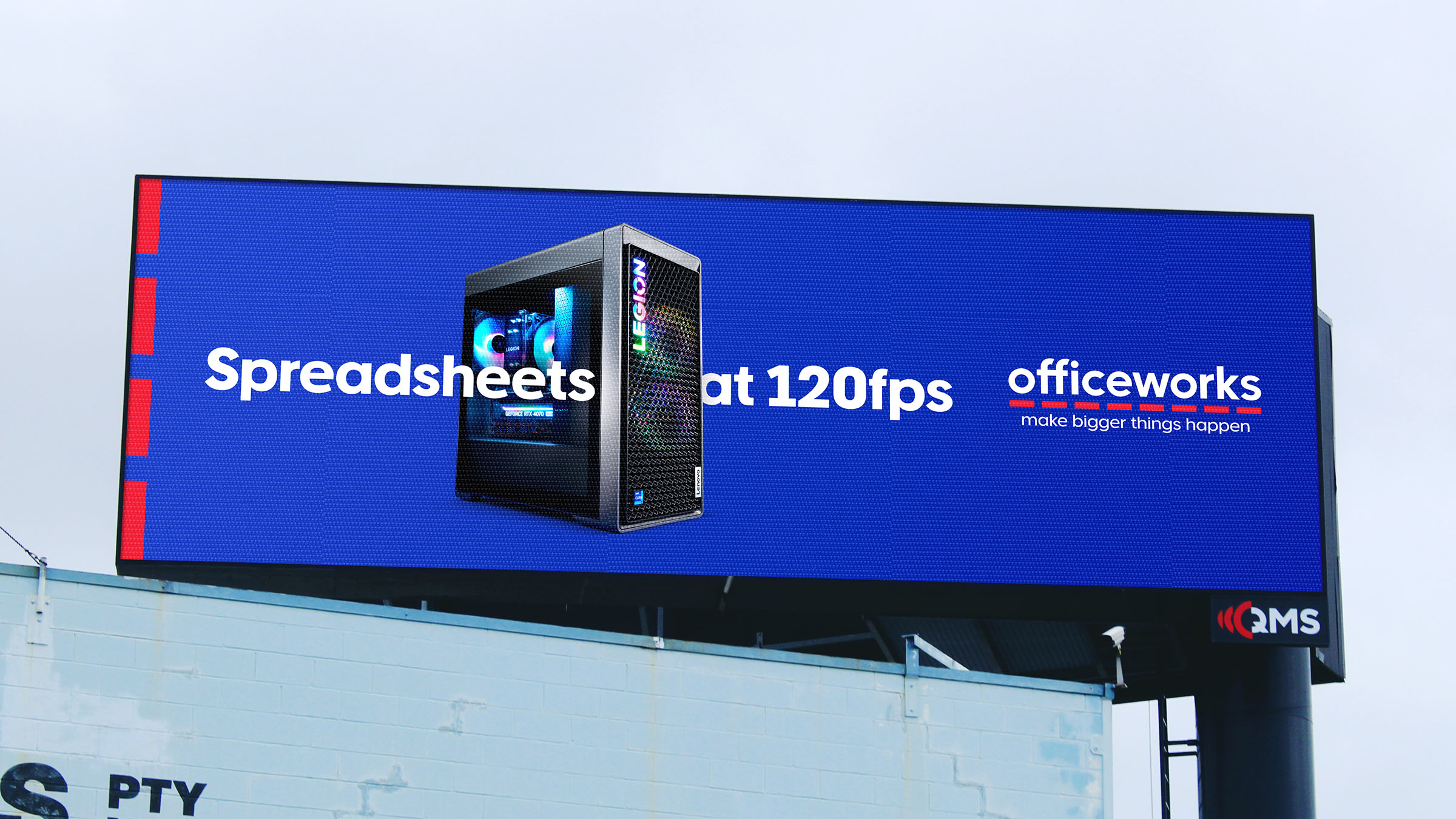
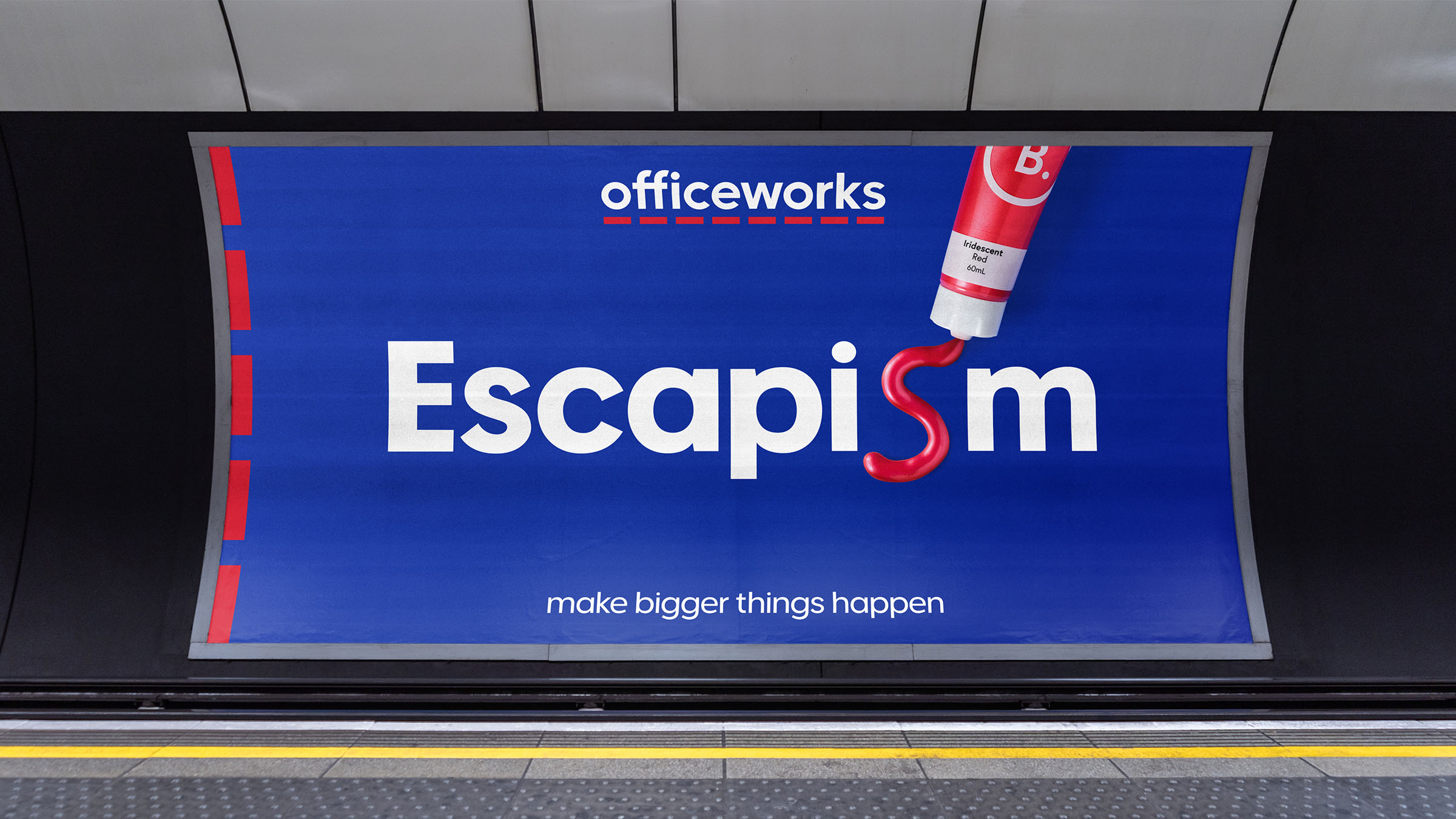
With brand metrics in decline, Officeworks reignited its ‘Make Bigger Things Happen’ platform through a bold national OOH campaign. From notebooks to gaming PCs, the work showcased breadth and emotional impact, reaching 12.2m people plus millions more through programmatic extensions.
As Design Director, I partnered closely with the creative team to craft a playful visual language and cohesive campaign identity that leveraged Officeworks’ distinctive brand assets, as well as overseeing and art directing campaign photography.
The result strengthened their position as an iconic Australian brand while strategically repositioning them as a retailer that is known for more than just stationery.
Work completed at ClemengerBBDO.


Client
University of Hull
Discipline
Brand Identity
University of Hull
Discipline
Brand Identity
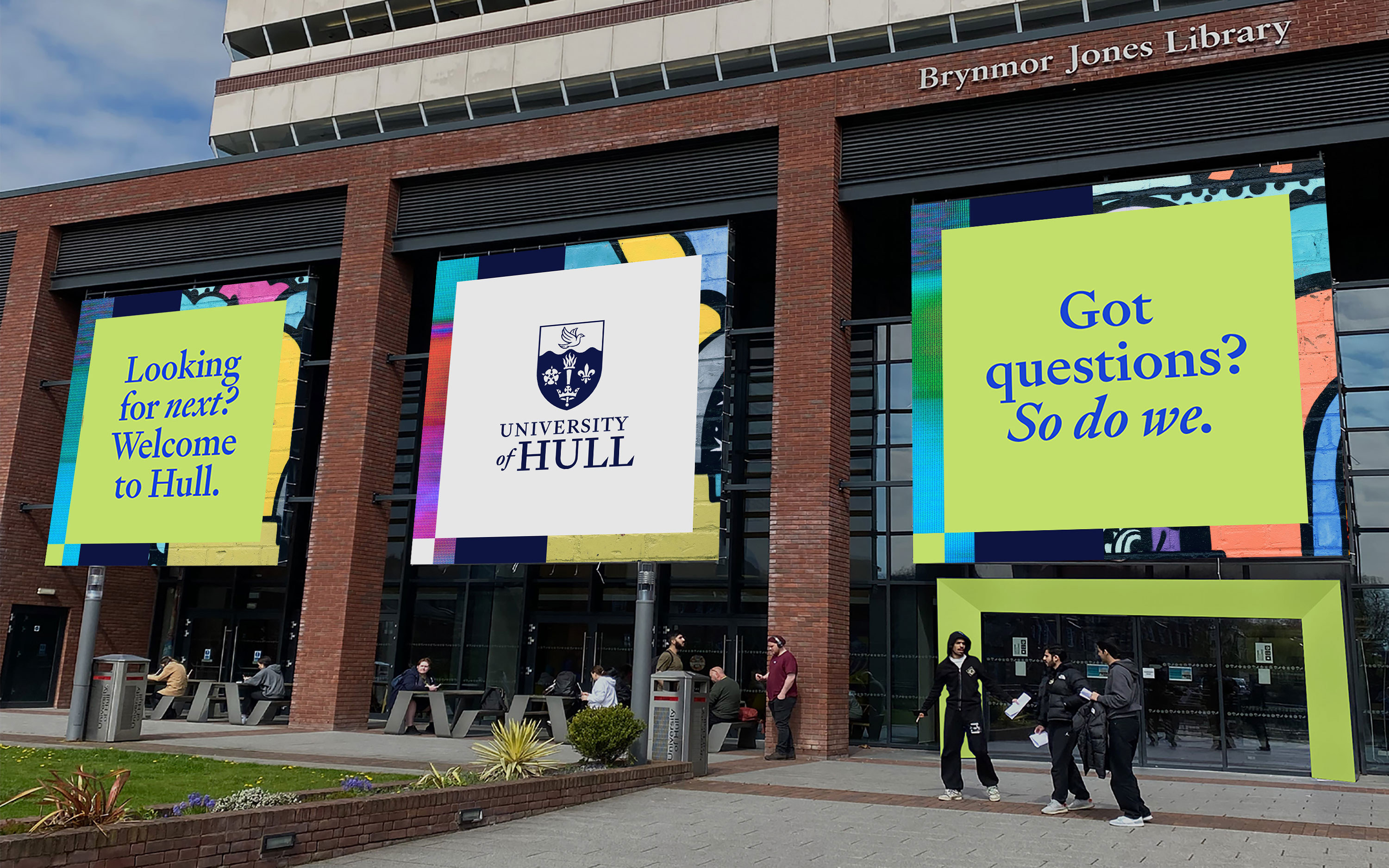
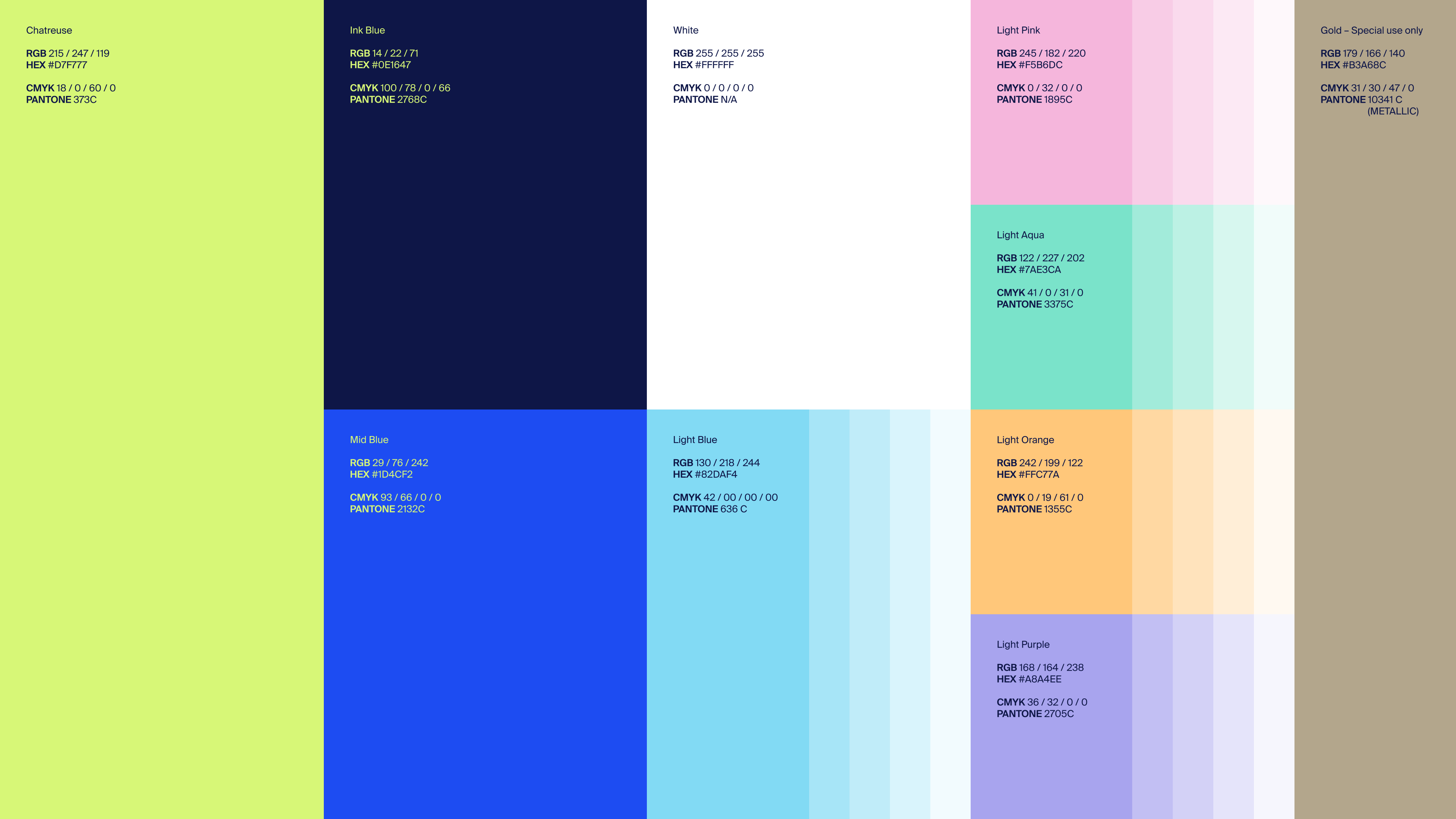
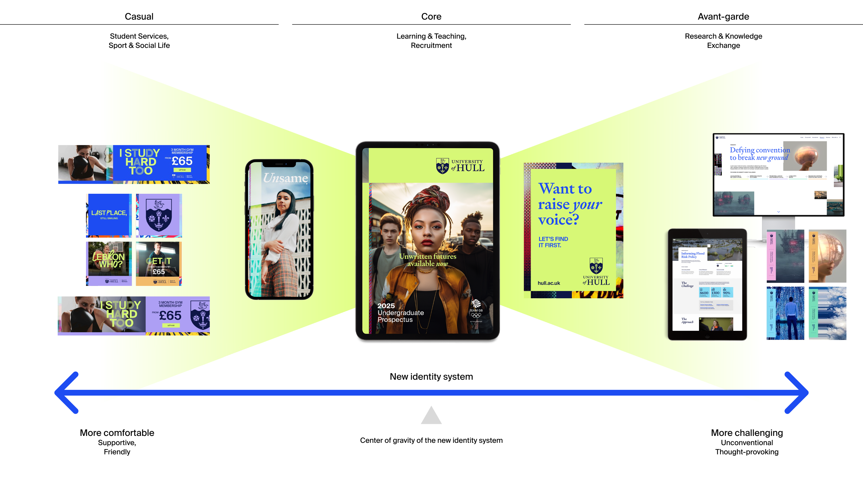
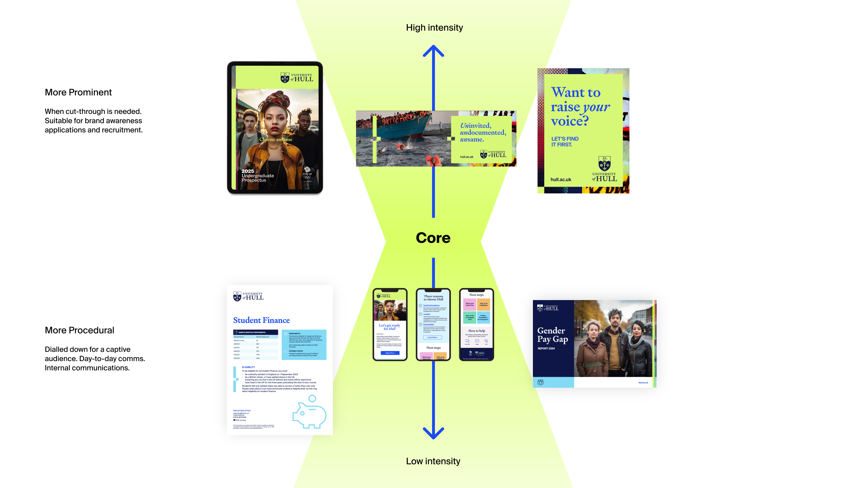
Comprehensive rebrand for the University of Hull in the UK. I worked as Design Director alongside a talented team of individuals on a complete rebrand. The project included a newly illustrated coat of arms & brandmark, colour palette, typography, design system, motion design principles, motion templates, photography library, signature music, sonic logos, verbal identity, icon library, digi-display/social campaign, and a brand video.
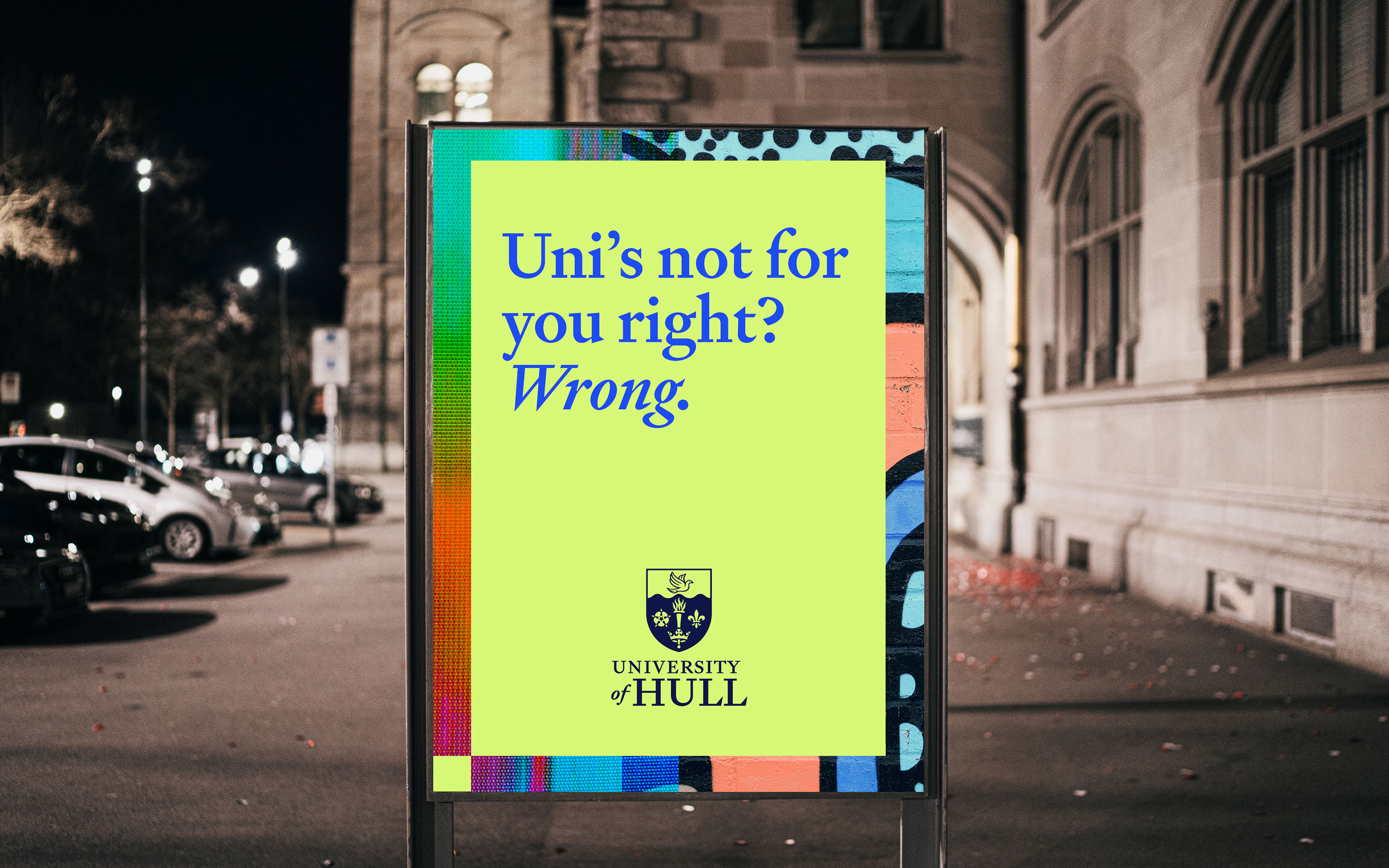
The University of Hull needed to reposition themselves in the crowded and competitive UK University market. They had lost a feeling of prestige – something we endeavoured to revive while simultaneously making them feel like a cutting edge, progressive, and contemporary institution.
An electric chartreuse green colour cuts through the noise, giving them a visual identity like no other Uni in the UK, accompanied by a design system that can dial the intensity up and down according to its context.
Work completed at PUSH Collective.
Brand Strategy: Erminio Putignano
Group Account Director: Catheryn York
Creative Director: Ken Shadbolt
Senior Designer: Shinhea Kim
Senior Designer: Gareth Davies
Brandmark Illustration: Peter Horridge
Motion Design Principles: Ryan Walker
Finished Art: Andrew Fowler Brown
Video Editor: Brett D’Souza
Verbal Identity: Pete Watman
Photography: Dan Medhurst
Sonic Identity: S:amplify

Primary brandmark

Secondary/Tertiary brandmarks

Ceremonial brandmark

Sports Crest


Client
Krneta
Discipline
Web Design (UX/UI)
Art Direction
Krneta
Discipline
Web Design (UX/UI)
Art Direction
After a recent rebrand, Krneta, needed a complete redesign for krneta.com.au, as well as design and art direction for their corporate stationery and signage.
Work completed at D&O. Web development by Formwork.
Work completed at D&O. Web development by Formwork.


Client
7-Eleven
Discipline
Visual Identity
Brand Guidelines
Art Direction
7-Eleven
Discipline
Visual Identity
Brand Guidelines
Art Direction
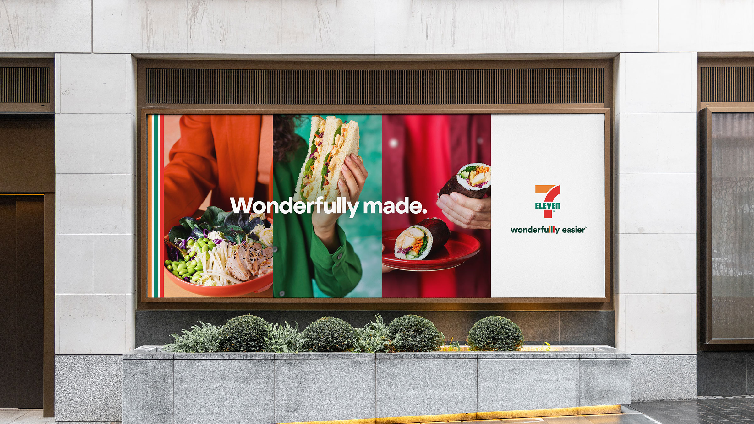
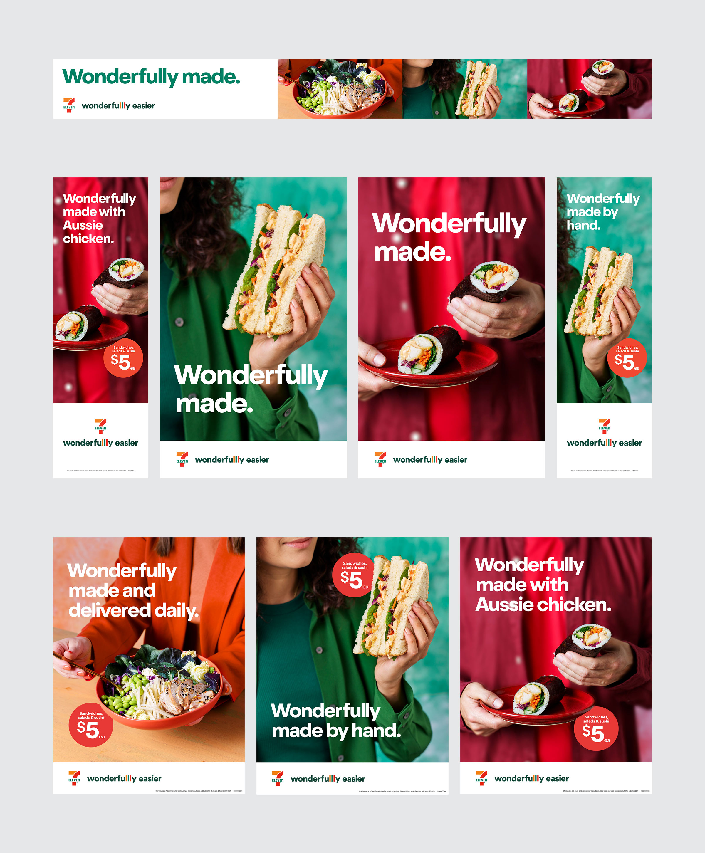
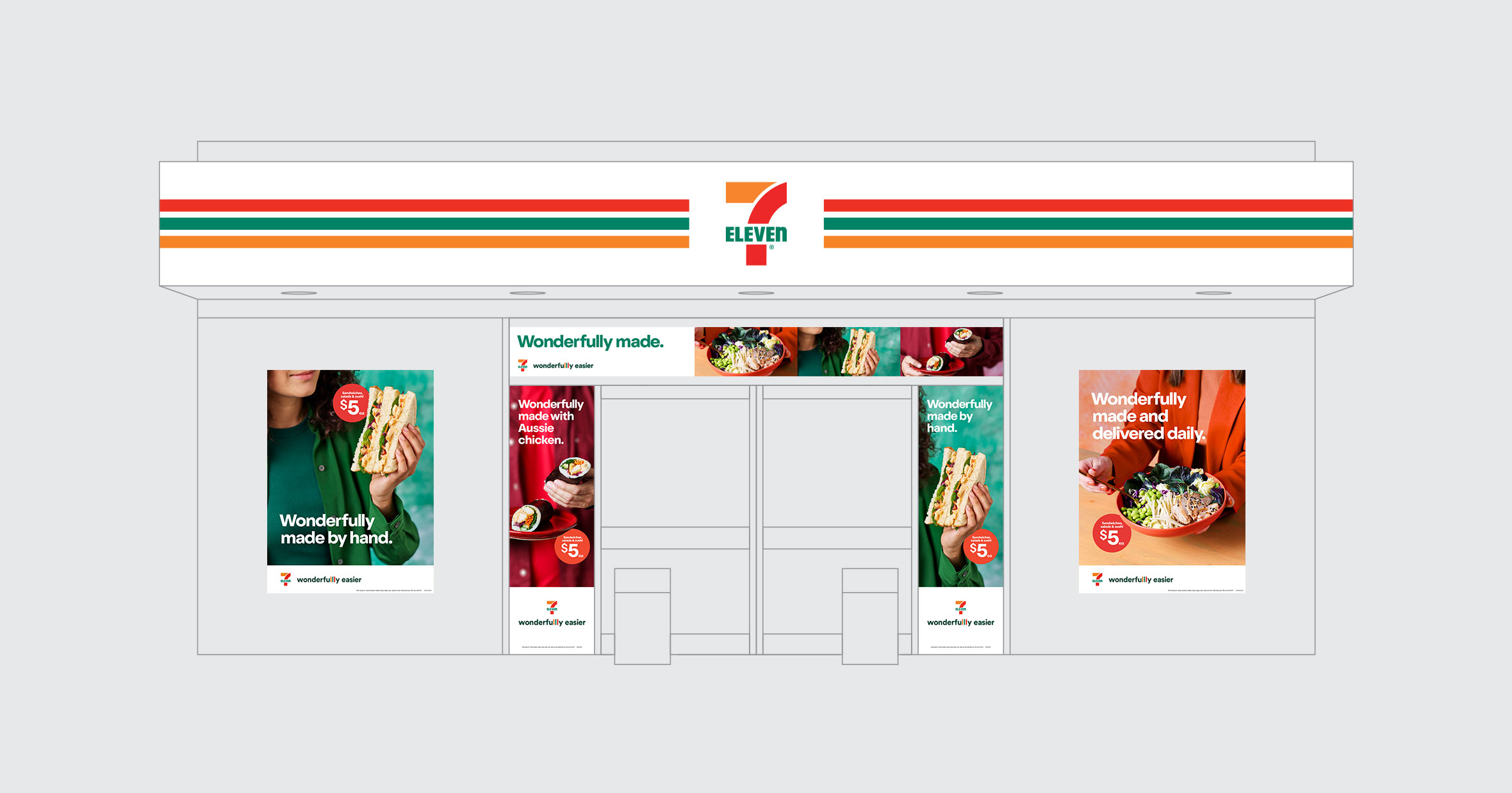
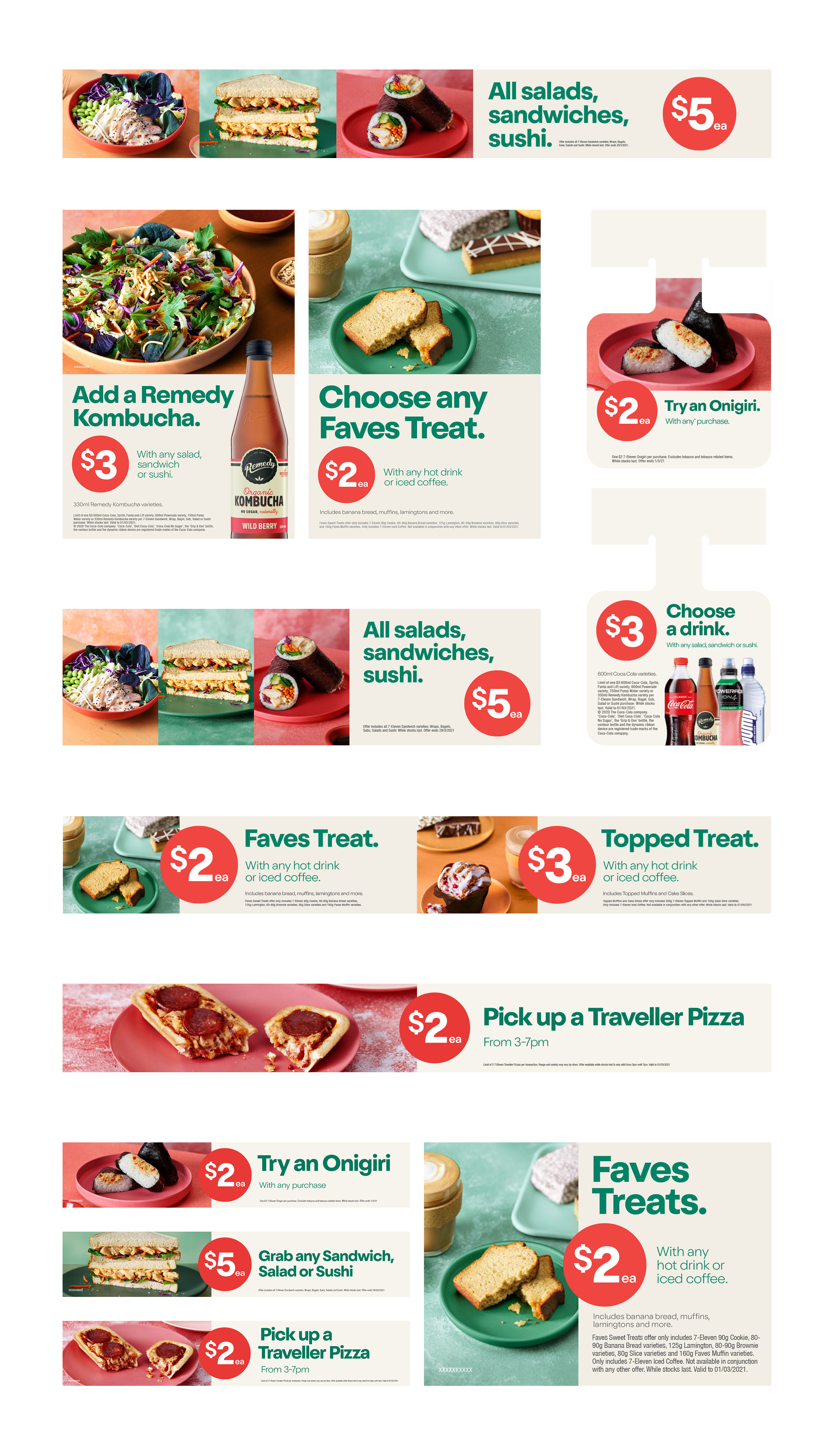
Brand refresh for 7-Eleven Australia. This was a large project with a lot of moving parts and multiple stakeholders.
Looking to reposition themselves in the marketplace and improve the perception of their food offerings, a full brand refresh was undertaken. Starting with the new brand platform ‘Wonderfully easier’, the visual ID was stripped down to its bare bones and rebuilt to reflect this sentiment. This included a cleaned up logo lockup, a new typeface with custom glyphs, revamped photography, an expanded colour palette, new outdoor advertising and point of sale templates and a completely new 100+ page brand guideline document.
Work completed at CHEP Network
Out of home advertising


Logo hygiene
Outdoor point of sale: consideration
In-store point of sale: conversion
Brand guideline: selected pages

Brand exploration

Client
Four Pillars
Discipline
Visual Identity
Four Pillars
Discipline
Visual Identity
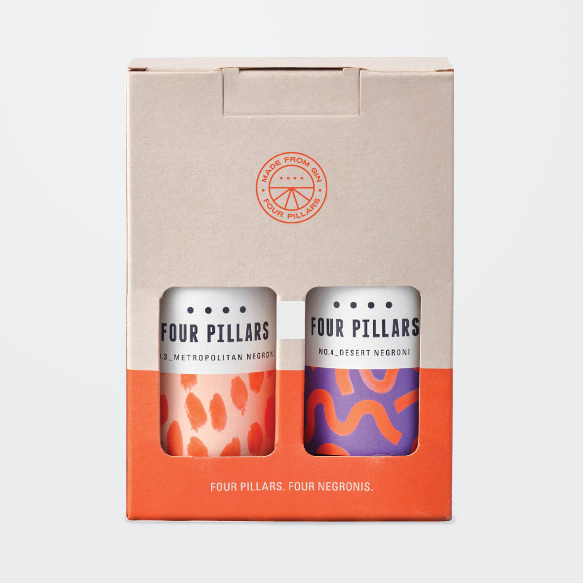
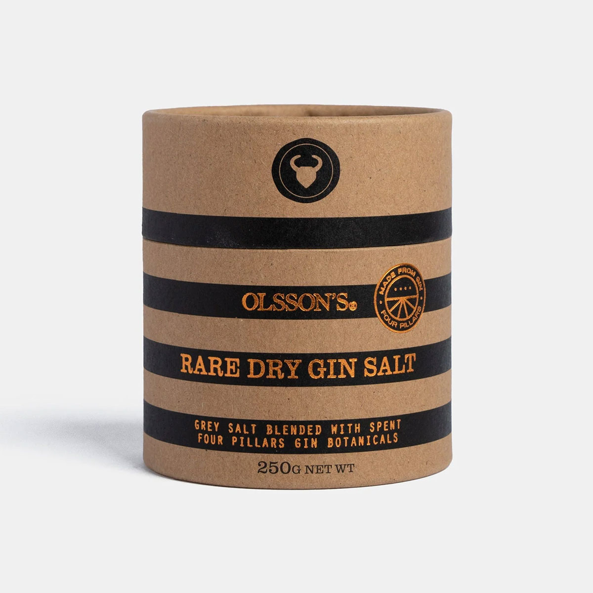
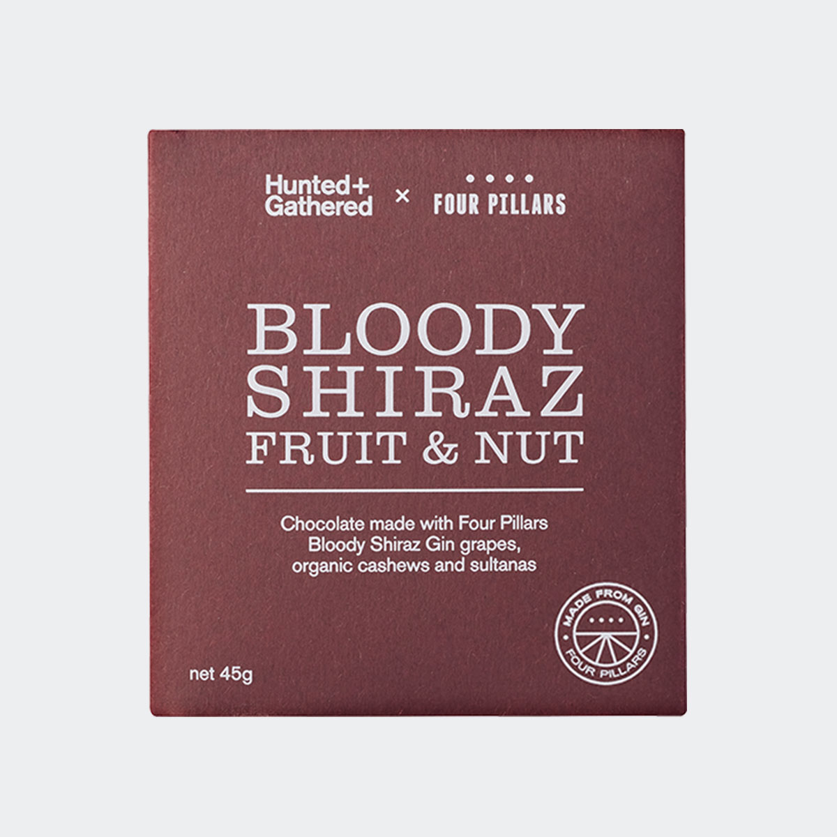
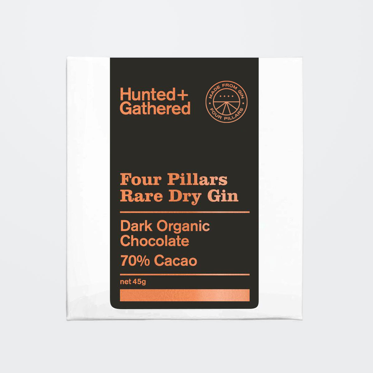
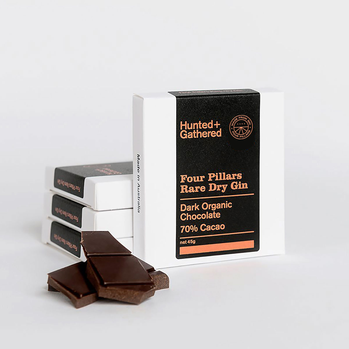
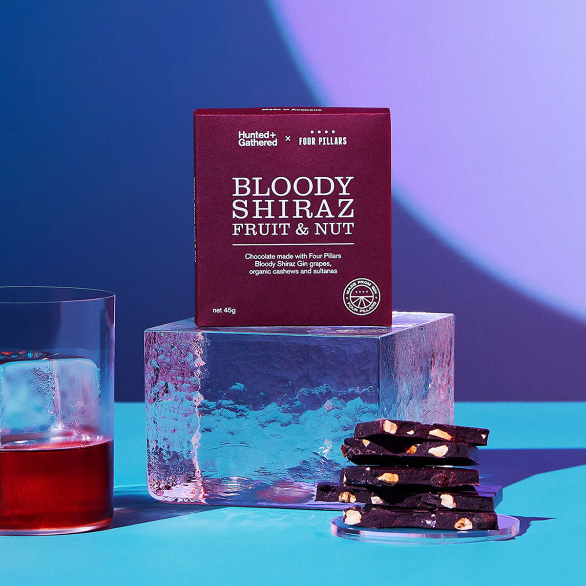
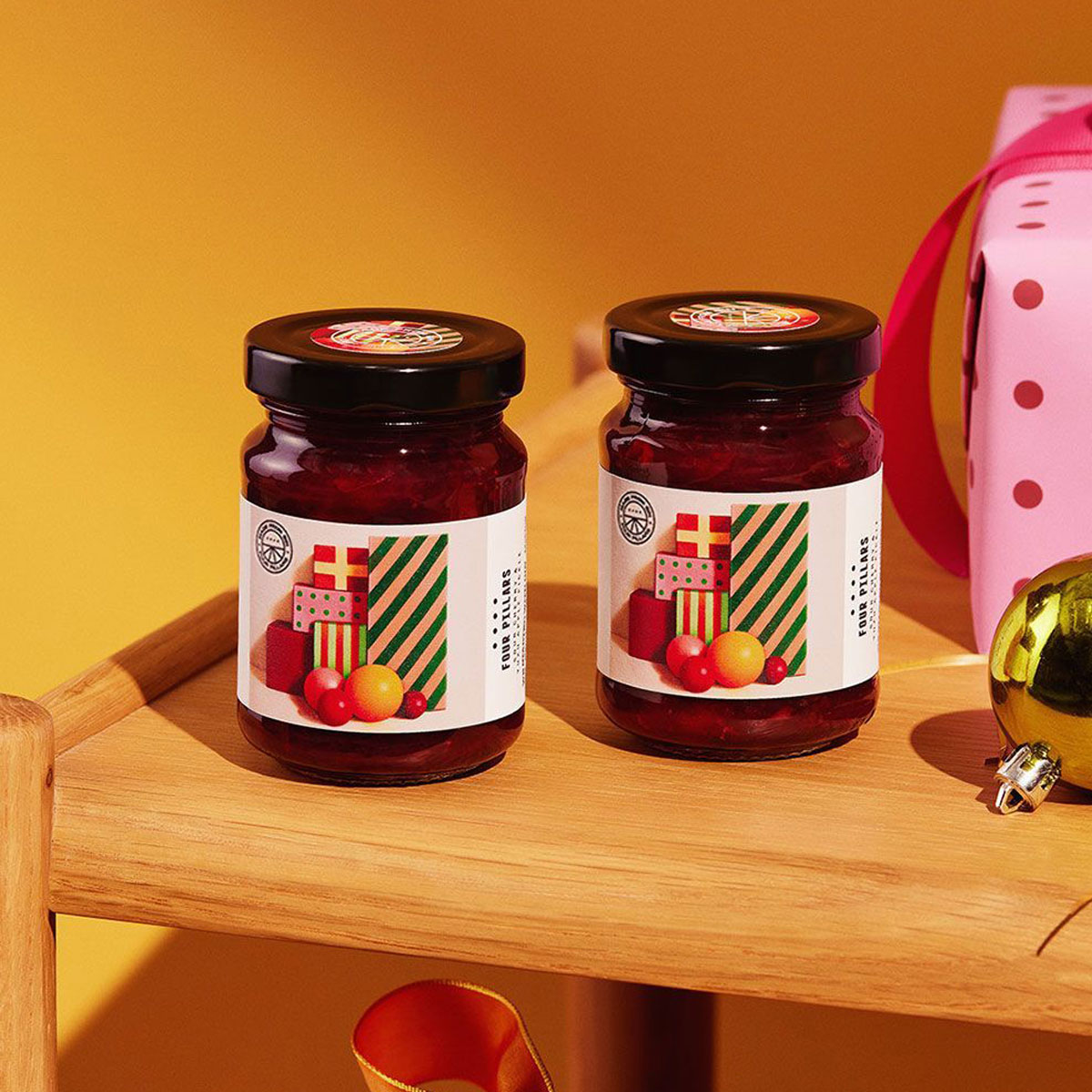
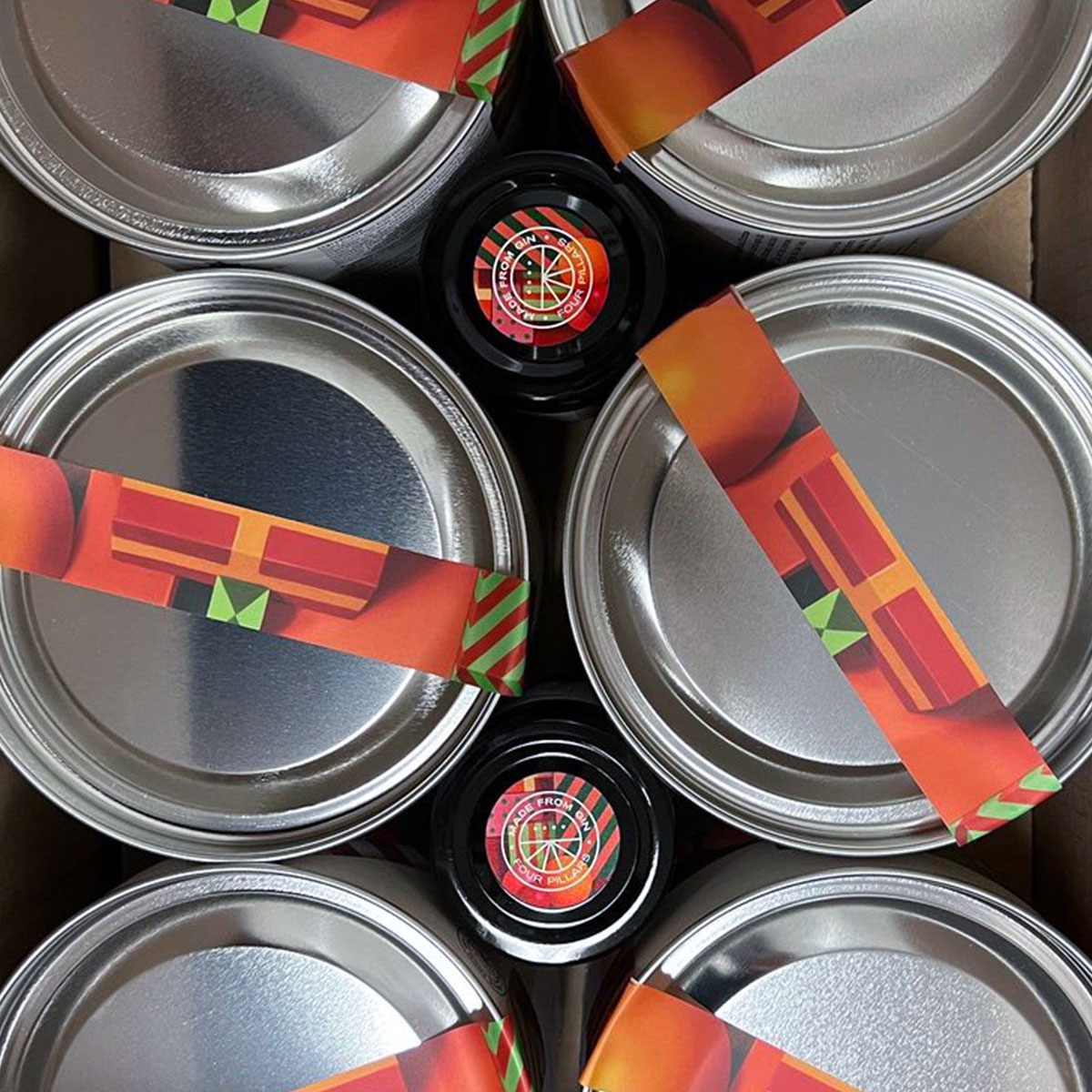
Logo roundel for the Four Pillars sub-brand Made From Gin—a range of edible products created from the leftover botanicals used in the gin making process.
Drawing inspiration from fruit stickers, the logomark integrates the Four Pillars parent brand with a fresh identity that has a personality of its own.
Work completed at Weave
Drawing inspiration from fruit stickers, the logomark integrates the Four Pillars parent brand with a fresh identity that has a personality of its own.
Work completed at Weave